The Where Are My Travelers (WAMT) Map widget allows users to see where current travelers are and drill down to see specific traveler detail. It also shows travel warnings and alerts.
Overview
The 'Map - Where Are My Travelers' interactive widget allows users to see where current travelers are and drill down to see specific traveler detail. It will also show the U.S. State Department Travel Warnings, Disaster Alerts, and Coronavirus data from Johns Hopkins.
You can adjust the Settings to see any combination of the above. You can quickly zoom to see the location of a traveler. You can create an area using the Drawing feature that allows you to have a specific area to focus on.
Please Note: We suggest using either the Dashboard Standard Full Page or the Standard Banner Top layout to make sure you have a grid that goes the width of your screen. Or, you can use a layout you created, just make sure the widget is in a grid that is the width of your screen.
Settings Tab:
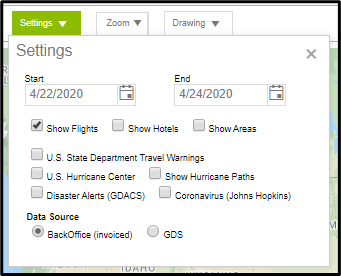
Choose the options you want to display on the map, using the Settings Tab.
- Start and End Dates: The date range has a max of 3 days and changing the Start date will automatically change the End date to be 3 days later.
- Show Flights: Show Flights will show any flights in the date range chosen. (See additional information on drilling down flight information below)
- Show Hotels: This option is only functional for clients that have our GraspSNAP Hotel Normalization product. It will then show hotel stays within the date range chosen. (The hotel drill down feature will work the same as the flights drill down functionality)
- Show Areas: Show Areas will allow any areas created in the Drawing tab to show on the map.
- Additional Crisis Filters: Enabling any of these will show areas affected and give detailed information when clicking on the alert.
- Data Source: Back office (invoiced) data is the default. GDS data is only an option for clients that have our GDS feed.
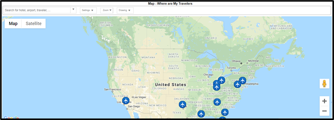
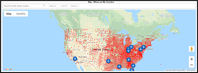
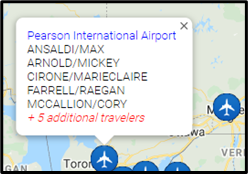
When Show Flights is enabled, you will see icons throughout the map where there are travelers with flights during the date range chosen. Where you see numbers (such as 5, 6, 7) in the below screen example, that means that because the map is zoomed out, it is combining nearby airports. As you zoom in, each airport will show individually.
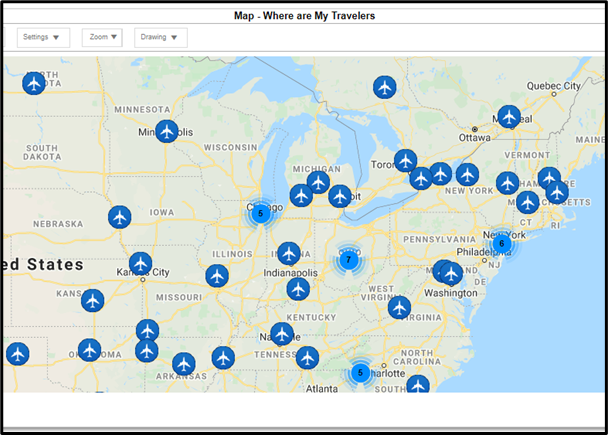
Hovering your mouse over an airplane icon will show you up to 5 traveler names, and if there are additional travelers it will show the number of additional travelers.
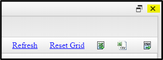
Clicking on the airplane icon will open a window similar to a spreadsheet where you can view and filter the data. You can also export the data into an Excel or CSV document. To close the spreadsheet, click on the X in the upper right corner of the tab.
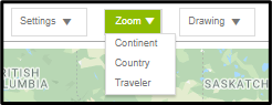
Zoom Tab:
The Zoom tab zooms in or out several levels at once vs. using the +/- in the right corner.
Drawing Tab:
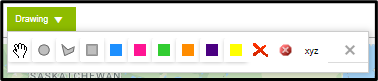
The Drawing tab allows you to create “Areas” that you can enable to show on the Settings tab. You can draw a circle, square or create your own shape by clicking on the shape type you want to create.
To create a circle or square area, click on the circle or square icon. Then, put your cursor on the area you want the shape to be over, and use your left-click mouse and drag to make the shape the size you want. When you release the left mouse button, a window will open where you can add a name for the Area. You can also move the shape itself once it’s been created by dragging and dropping, and you can resize the shape by clicking within the shape and adjusting the borders.
To create a custom shape, click on the middle shape icon, then put your cursor on the area you want the shape to be over. Click your left-click mouse to start the shape outline. Move your cursor and click to add the next border point of the shape. Continue to move your cursor and click on the border points you want in the custom area. Finish by clicking on the first spot you clicked on to complete your custom shape and bring up the window prompt to name the Area.
You can delete a selected area by clicking on the area, then click on the large red X icon. You can delete all areas by clicking on the round x icon.
You can rename any area by clicking on it, then clicking on the xyz icon.
You can also delete, rename or change the color of any area by right clicking within the shape to get a popup window to make your changes.
Note: For additional information on using the Dashboard, please use the links below to access our general page about the dashboard or our three short video tutorials that focus on the dashboard.