The GraspDATA Dashboard allows a user to have multiple dashboard pages to be able to group widgets on separate pages.
The GraspDATA Dashboard allows a user to have multiple dashboard pages to be able to group widgets on separate pages. This document instructs how to create custom layouts if desired, create dashboard pages, and add widgets.
- Layout Builder: A layout is the grid of the dashboard page that allows how many widgets can be on the page and the sizing the widgets will be. There are 4 Standard layouts the user can choose from, but users can create customized layouts as well. Click Here to access a short step-by-step video about this subject.
- Dashboard Pages: A user can create up to 10 dashboard pages to allow each page to have a different layout and its own grouping of widgets. Click Here to access a short step-by-step video about this subject.
- Adding Widgets: A user can add widgets to each dashboard page to show air, car, hotel data and more. The number of widgets allowed on a page is determined by the layout chosen for that page. Click Here to access a short step-by-step video about this subject.
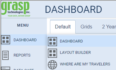
A user can get to the Dashboard and Layout Builder from the Menu. If you do not see Dashboard as an option, reach out to your Agency Admin to ask if it can be enabled.
Layout Builder:
Layouts define the location and size of areas on the dashboard page where widgets reside. There are standard layouts that can be used when creating a dashboard page, or a user can create their own custom layouts. This section will explain how to create a custom layout.
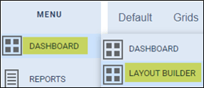
From the Menu, go to Dashboard > Layout Builder. Click on Layout Builder which will open the Dashboard Layout Designer.
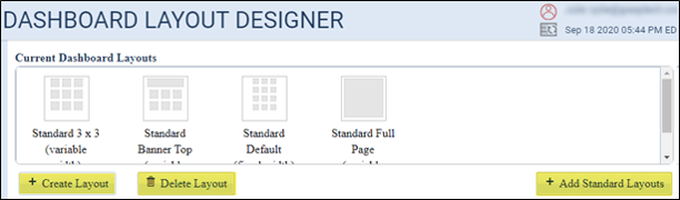
You will see 4 Standard Layouts:
- Standard 3X3: This will allow 3 widgets each for 3 rows
- Standard Banner Top: This will allow the top widget to be the full width of the page, then will give 2 additional rows of 3 widgets
- Standard Default: This will allow 3 widgets each for 4 rows
- Standard Full Page: This will allow one widget on the page (useful for our Interactive Map – Where are My Travelers)
To create a new, custom layout, click the Create Layout button on bottom left. This will open the New Dashboard Layout page as seen below.
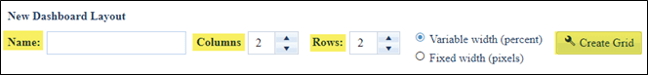
- Name: You will need to enter a name for the new layout. Please Note: Do NOT use any special characters in your page names, including the apostrophe ' symbol - ONLY use alpha and numeric characters.
- Column and Rows: Choose the starting number of columns and rows that will make up the base layout. You must choose at least one and the maximum is six for both columns and rows. You can remove some of the areas from the base in the next step, but you cannot add additional rows or columns, so start with the largest number you will want to display in the layout.
- Variable width (percent): This is the default and will allow the widgets to adjust in size based on your screen size.
- Fixed width (pixels): This will keep your widgets the same size regardless of your screen size.
- Create Grid: Once you have named your layout and chosen your starting columns and rows, click on Create Grid.
In our example we have chosen 2 columns and 2 rows to allow space for 4 widgets. Once you have clicked on Create Grid, you will see the following:
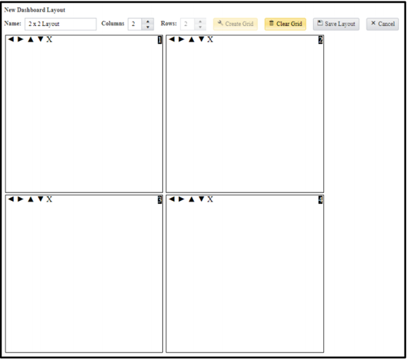
At this point you can resize any of the areas by using the up, down, left, or right arrows within the area. You can also remove any of the areas by clicking the X.
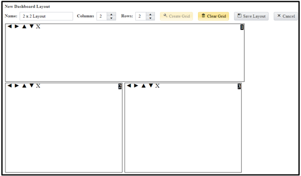
For example, if you decide you would like the top to be one grid the width of the screen, you could remove area #2 (top right area) and then resize area #1 to take up the top portion of the layout.
This would give you the following:
- Clear Grid: This will remove the current layout and allow you to start from scratch.
- Save Layout: Saves your new layout. Once the layout is saved, it will be available to use on new Dashboard pages.
- Cancel: Will return you to the Layout Designer page.
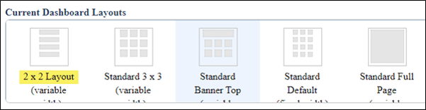
Once you click on ‘Save Layout’ you will be returned to the Dashboard Layout Designer page and will see your custom layout in the Current Dashboard Layouts.
NOTE: A current layout cannot be edited once it is created. You would need to delete the layout and create a new one. You can change the layout you assign to a Dashboard page.
Dashboard Pages:
The GraspDATA Dashboard allows a user to have multiple dashboard pages to be able to group widgets on separate pages. The following information instructs how to create custom layouts if desired, create dashboard pages, and add widgets. Each Dashboard page can have its own layout that defines the number and size widgets on the page. You can have a different style for each page, and you can use Page Filters to easily update the filters for all widgets on a page. You have a maximum of 10 pages you can create.
Once you have a page created, see the Adding Widgets section click here below to learn how to add individual widgets to your pages. Also, the Dashboard is user defined, so each user can have their own Dashboard set up as they want. Dashboard pages cannot be copied to another user.
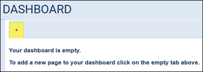
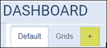
Creating the First Dashboard page – To create your first page on the Dashboard, click on the tab as shown below. (Hover your mouse on the tab and the + sign will display).
This will open the New Dashboard Page window as shown below.
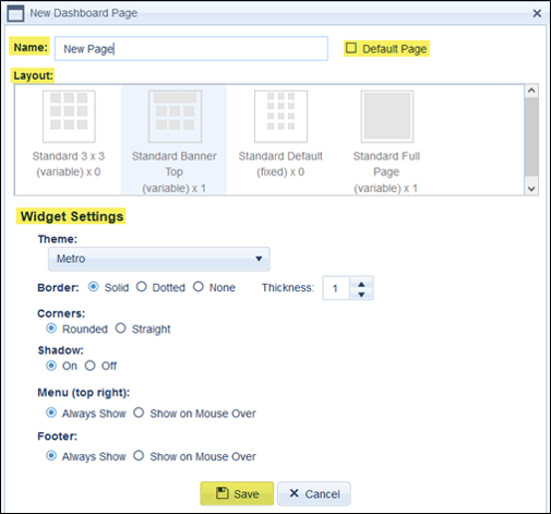
- Name: Enter the name that you would like displayed on the tab. The user can change the name of the tab at any time using the Page Setting Options. There are no restrictions for using the same name as another existing tab. Please Note: Do NOT use any special characters in your page names, including the apostrophe ' symbol - ONLY use alpha and numeric characters.
- Default Page: Clicking on this checkbox will make this the “default” page and will be the first page displayed when you go to your Dashboard.
- Layout: You must click on one of the layouts to select the layout that will be used for this new page. If there are more layouts defined than appear in the layout box, a vertical scroll bar will appear on the right side allowing you to see the remaining layouts.
- Widget Settings:
- Theme: Each page can have its own “theme”. A theme is a predefined list of colors that the widgets use for the charts.
- Border: Allows the user to choose a style of the border surrounding each widget on the page. You can also choose the thickness you would like the border to be.
- Corners: This affects the shape of the borders of each widget. If the border is set to ‘None’, this setting has no effect.
- Shadow: Activates a drop shadow of each widget when selected.
- Menu: The option for the Menu (3 bar) icon at the top-right of each widget is always displayed. Or, it could be set to only display when the user hovers the mouse over the top bar of the widget.
- Footer: The option for the widget footer information to always show. Or, it can be set to only display when the user hovers the mouse over the bottom bar of the widget. A widget’s footer shows information such as the date range used on the widget, drill-down, and filter icons.
Note: Once you create a Dashboard page, you can change the layout using the Page Settings in the Page Menu. Please notice a warning will display if choosing a layout with fewer widget spaces.
You can continue to create more pages up to the max of 10 pages. Just hover your mouse to the right of your tabs to display the new tab with the + sign. Click on the tab with the + sign to create another new page. When you create multiple pages, you will see each page as an individual tab.
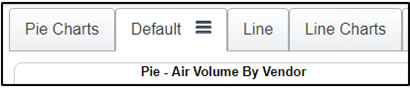
When you hover your mouse over a tab, you will see the Page Menu (3 bars) icon, beside the page name, as shown highlighted below.
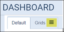
Clicking on the Page Menu icon will open the below menu:
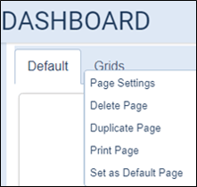
The Page Menu is where you can rename, delete, duplicate, print a page, make a page the default page, and more.
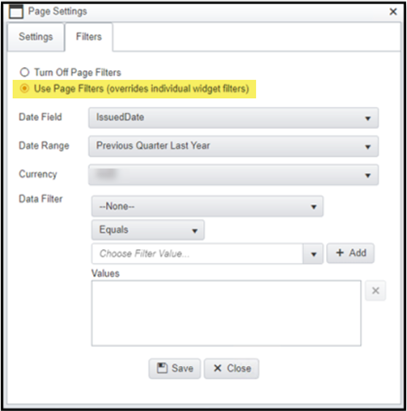
- Page Settings: Allows the user to change any Page Settings that were defined when the page was initially created.
- In addition, on the Page Settings window, there is a ‘Filters’ tab which allows the user to define Page Filters that will be used for ALL widgets on that page. Page Filters will override any widget’s individual filter settings. (See additional Page Filters notes below).
- Delete Page: Deletes the selected page and all of its widgets. Once a page (and its widgets) is deleted, it cannot be recovered.
- Duplicate Page: This option will duplicate the selected page onto a new page along with all of its settings and the widgets on the page. The user must enter a name for the new duplicated page. Note: Currently there is no limitation to naming the new page with the same name as the existing page.
- Print Page: When the Print Page option is selected, a new browser page is opened that displays a copy of the current page without the surrounding borders or menus. The browser print functionality is then invoked to allow a user to print the full dashboard page.
- Set as Default Page: Sets the currently selected page to be the default page, which is the page that is first displayed when the user goes to the Dashboard tab. Any other page currently set to default will be overridden by the selected page.
Additional Page Filters Notes: In the Page Settings window, click on the Filters tab to set up Page Filters. After selecting the filters you want to have for the entire page, click on Save.
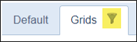
When you have Page Filters set up, you will see a filter icon appear if you click on the tab of that page.
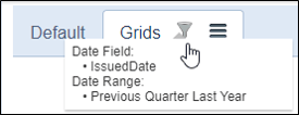
Hovering over the tab will then show the Page Filters that are being used.
Page Order: The order of the pages displayed in the tab bar can be changed by simply clicking and dragging any tab to a new location in the tab bar.
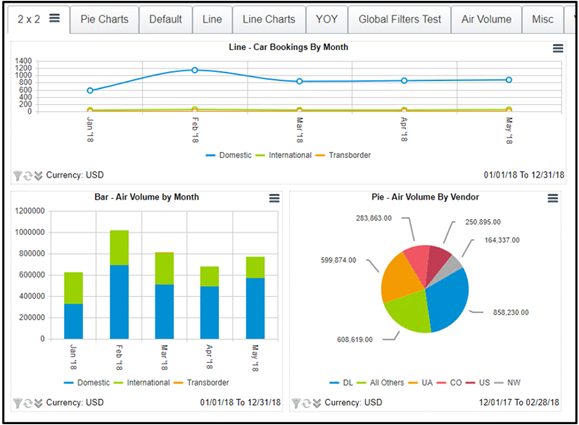
Adding Widgets
A user can add widgets to each dashboard page to show air, car, hotel data, and more. The number of widgets allowed on a page is determined by the layout chosen for that page.
When the user moves their mouse over one of the predefined page layout areas, a ‘Click here to add widget’ tooltip and + sign icon are displayed.
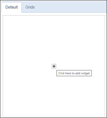
Clicking anywhere in the area will open the Dashboard Widget Editor window.
The settings that apply to the widget itself are on the ‘Settings’ tab, and the filters that affect the data displayed in the widget are in the ‘Filters’ tab.
Settings Tab:
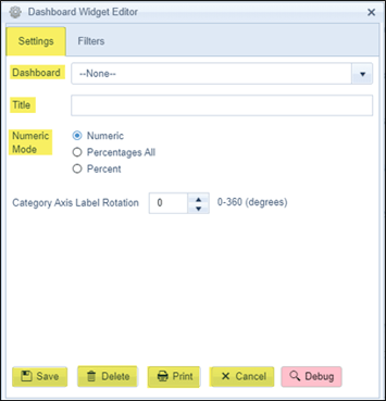
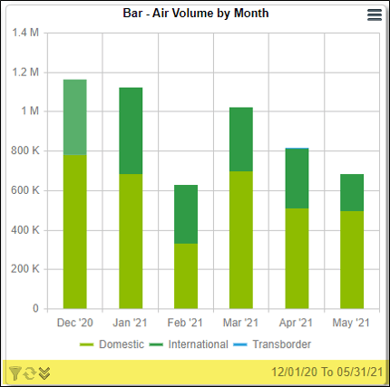
- Dashboard: Choose the widget you would like to display from the drop-down list. There are bar charts, pie charts, and line charts, as well as, other options.
- Title: This field is free form. It will auto fill the name of the Dashboard item selected, but the user can change it. Please Note: Do NOT use any special characters in your page names, including the apostrophe ' symbol - ONLY use alpha and numeric characters.
- Numeric Mode: The numeric mode options that are displayed (if any) depend on which dashboard widget is selected in the Dashboard dropdown.
- Numeric: Displays the values on the chart as (comma separated) numeric values. Although numeric values often represent currency amounts, this is not always the case, so no currency symbols are shown on widget values in Numeric mode.
- Percentages All: Shows each series as a partial percent of 100. I.e. the sum of all the percentages of each series on the chart will total 100%.
- Percent: Shows each series as part of a 100% value.
- Category Axis Label Rotation: This field allows the user to adjust the label rotation on the axis. This alleviates the labels running into each other on smaller widgets with many labels that would otherwise overlap.
Save: Click on Save to save the widget settings.
Delete: Click on Delete to delete the widget. You will get a pop-up confirming that you want to delete the dashboard item, clicking on OK will remove this widget from the page.
Print: When a user clicks on Print, a new browser page will open and display a copy of the widget. The browser print page functionality is then invoked to allow a user to print the widget.
Cancel: Click on Cancel to close the widget window without saving.
Filters Tab: Filtering can be done within the widget itself or can be overridden on the Dashboard Page Settings by using Page Filters.
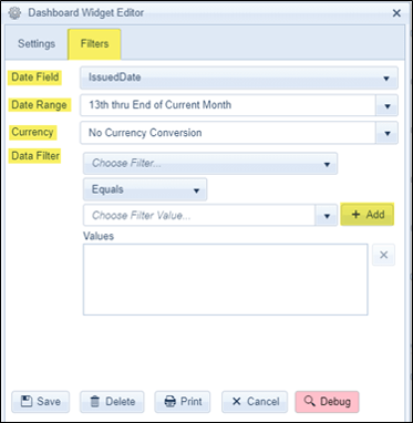
Date Range: The default is the top item in the date range list, but when using the drop-down list, there are many recurring date options. This list is the same list a user sees when setting up batches in Report Schedules.
Currency: This field is only functional for users that have our Currency Conversion product.
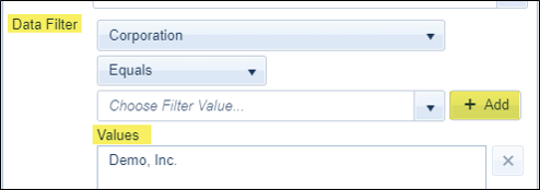
Data Filter: This field is only visible for Agency Admins and Agency Users. This field allows users to filter by Data Sources, Corporation, or Sort Field.
- Using the drop-down list for ‘Choose Filter’, the user will select what they want to filter by. Choose Equals or Not Equal To from the next drop-down list. Then, in the ‘Choose Filter Value’ drop down, select what you want the widget to filter for. Click the [+ Add] button to lock the selection into the ‘Values’ box. You are able to select more than one Filter Value, making sure to click on the [+ Add] button each time to lock in selections. In the example below we show filtering by Corporation and we have chosen to filter the widget for Demo, Inc.
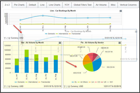
Moving Widgets: Widgets can be moved to any other layout area on the same page by simply clicking anywhere on the widget, holding down your left-click mouse and simultaneously dragging the widget to a new location.
If you drag a widget to a location already occupied by another widget, the widgets will swap places. Also, the widgets will automatically resize to the size of the area they are moving to.
Widget Drill Down: Clicking on any area on a chart will open a drilldown page that shows the chart (with the selected area highlighted) along with an Excel like grid that shows all the data used to populate the selected area.
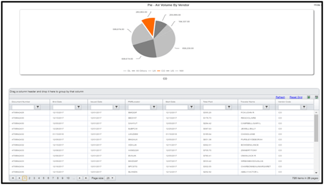
On the drilldown page you can page through the grid pages (if there is more than one), filter the grid data, and export the grid data.
On the drilldown chart, you can click on a different area on the chart to refresh the grid data and show the data for the newly selected area.
If you click on the same area that is already highlighted, all the chart’s areas will be highlighted, and the grid will refresh to return the data that comprises the entire chart. Note: Showing all the chart data, with all areas selected, can also be done by clicking on the widget’s ‘Drilldown All’ button on the widget footer (detailed in the next section).
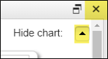
In the upper right corner of the chart window there is an option to ‘Hide chart’ by clicking on the up arrow. This will minimize the chart and only show the grid data.
Clicking on the X in the upper corner will close both the drilldown chart and grid and return back to the Dashboard page.
Widget Footer: The widget footer shows icons along with the currency conversion (if applicable) and the date range of the data being displayed.
The first icon is the filter icon and when hovering your mouse over this icon, a tooltip will appear with the current filters being used. Note: The filter icon will NOT appear on the footer if Page Filters are being used on the page.
The second icon is the refresh button. Clicking this icon will redraw the widget’s chart with the latest data brought into GraspDATA. (The Dashboard does not auto refresh while a user is logged in).
The third icon is the ‘Drilldown All’ button. Clicking on this icon will open the widget drilldown screen, displaying the chart and all of the data used to populate the chart in an Excel like grid.